

Providing a large assortment of products to their customers, Kohl's is a long-standing retail chain known by many. However, one of their biggest drawbacks is the lack of good user experience design on their website which makes it difficult to navigate. As part of my UX course, I decided to improve upon their current website layout to be more user-friendly and better target their clientele.
The Idea
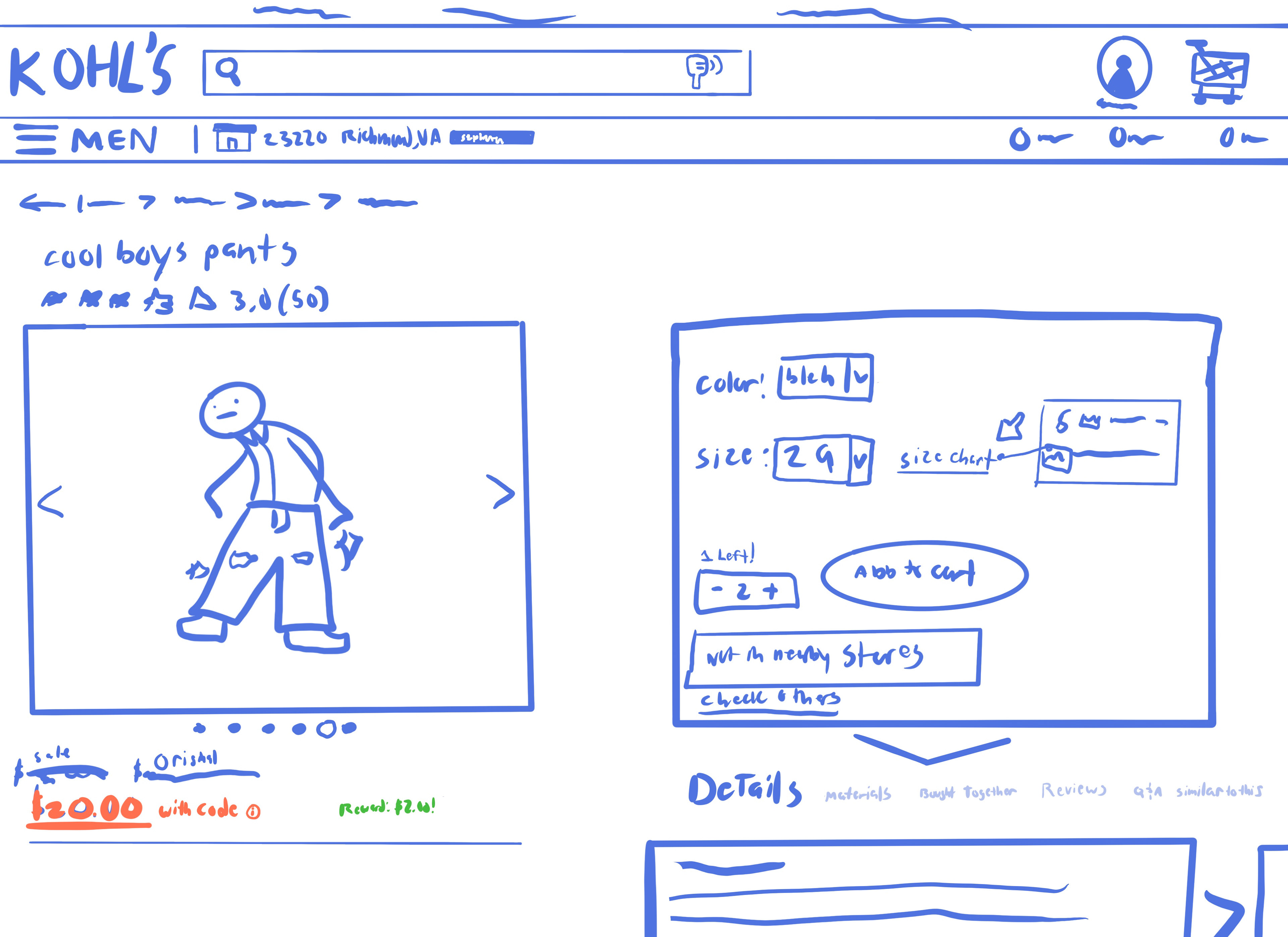
The current Layout of the product page when looking at an item is very cumbersome, with all photos always in place, causing users to have to scroll an excessive amount to view details and reviews. Less scrolling is better for users, especially for those with physical disabilities and health issues. Since Kohl's more recent reports claim that they want their brand to cater more towards people with physical disabilities, creating a space with less scrolling is an even more important factor for some of their target users.
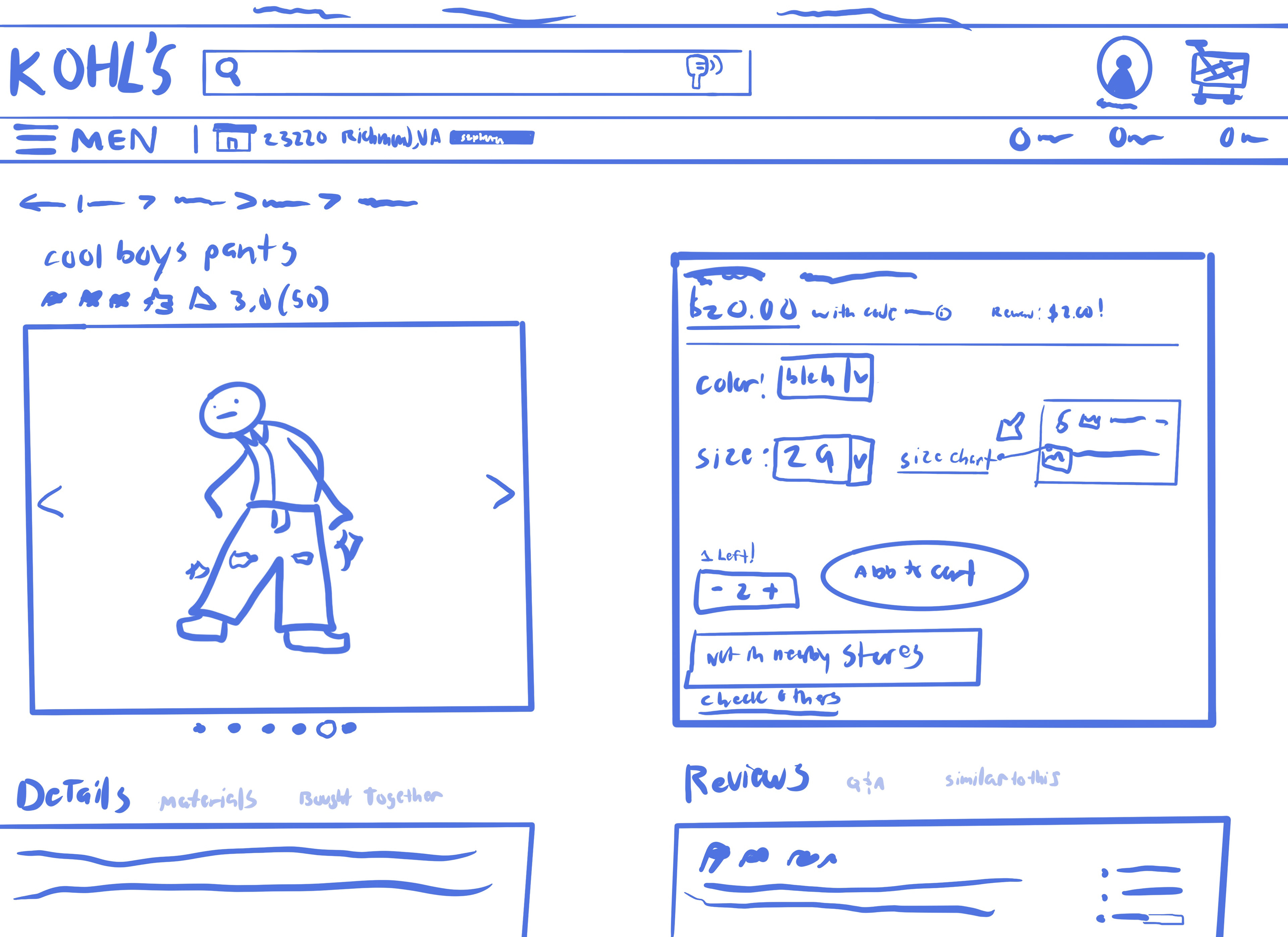
In the sketch, the price and photo, which are now placed in a simpler slideshow format, are instead focused on the left side, while everything else can be accessed when scrolling down on the right side. I thought this could be an effective way of displaying items so that no matter where the user goes (whether to check details, reviews, etc.), the product and price are always displayed, which can help increase the chance of purchases as well. All of this is done to reduce scrolling and make sure there isn't too much information overwhelming the user at once.
The Execution
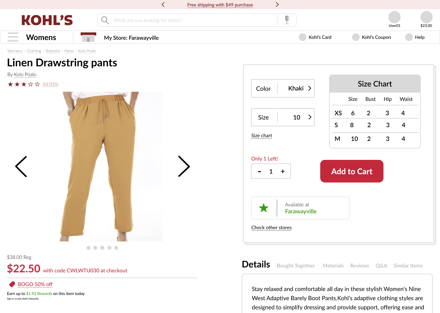
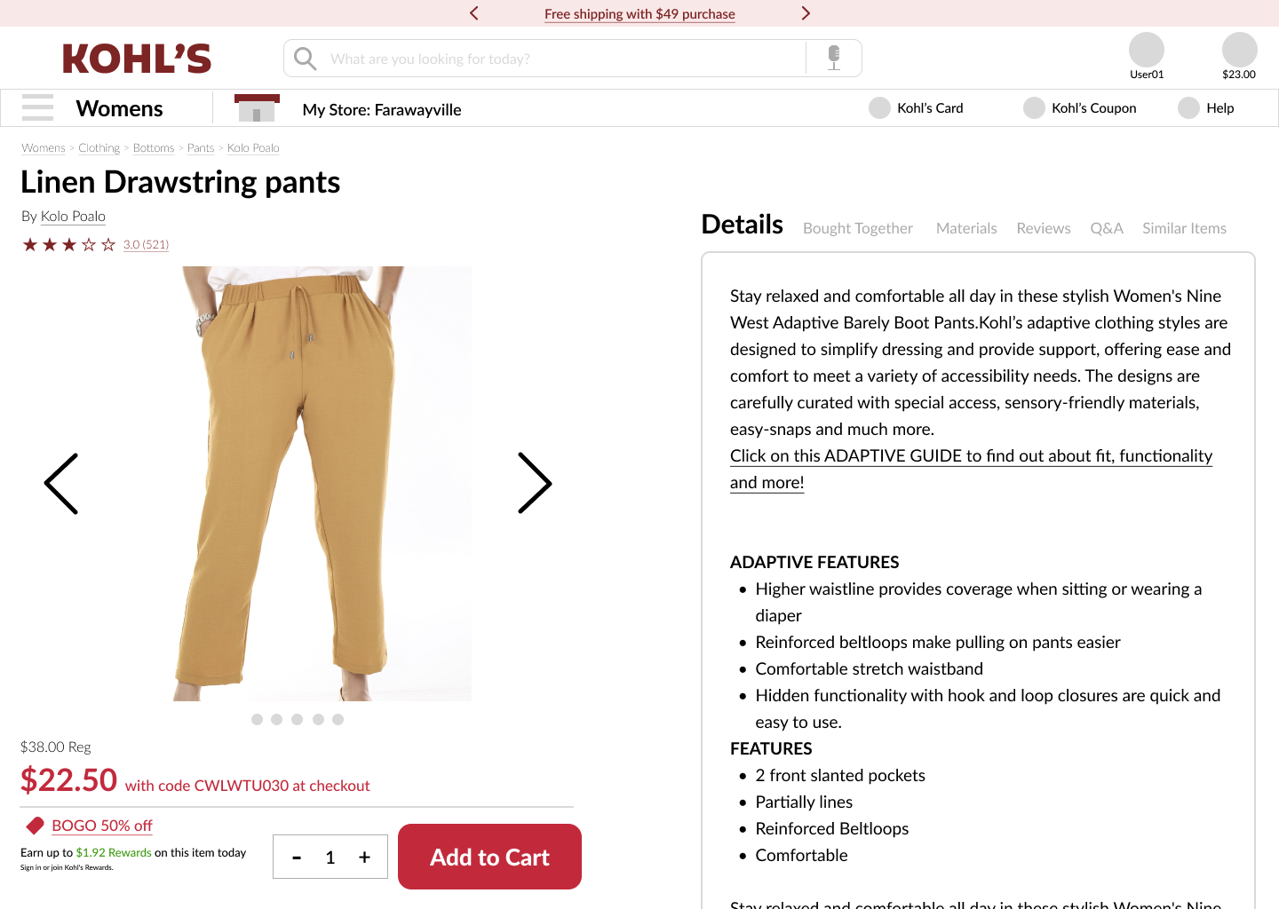
As I moved on to the final execution, I wanted the add to cart button to be placed at the bottom part of the left section. This makes it easier for consumers to add items to their cart since they won't have to scroll back up if they scrolled down to reviews or details, and it makes it much more convenient for those with mobility issues so that they don’t have to scroll back up. Hovering over color, size, and the size chart also prompts a screen to the right of them to provide more information. This makes it so that there isn't too much information cluttering the screen at once like the original page.