
For my UX course, we were assigned a challenge to revise a music app's interface. While I had a lot of apps that I was interested in finding ways to revise, there was one that I felt had the potential to be even better with a few tweaks: Trebel. Their app aims to stop the ongoing piracy issues with music by providing a platform at no cost if the listener desires, while still being able to fairly compensate artists.
New Interface
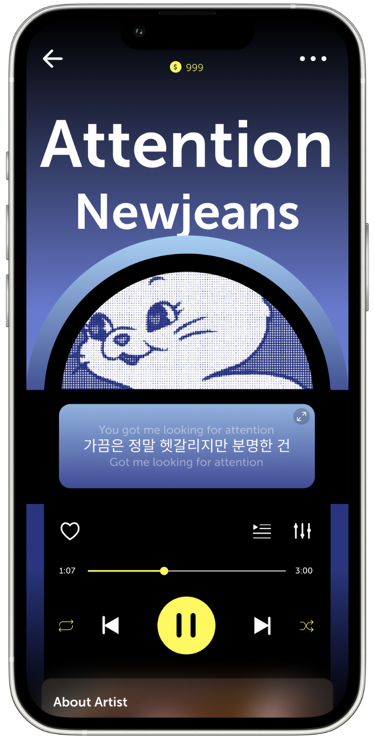
Users can listen to whatever music they want by using coins, which can either be refilled and earned every day for free or purchased. When I first heard about this, it reminded me of a traditional jukebox since you can also listen to music with it by inserting coins. On top of cleaning up the interface, I designed it to feel and look just like a jukebox to create a more unique and enjoyable experience for the user.
In this new interface, the coins are placed right in the center at the top of the screen so users know how many coins they have left. Most of the music player is placed in a simplified version of a jukebox, which will change colors(along with the background) based on the dominant colors of the album cover. Using the shape of a jukebox, the cover of the album is placed in the area where the records inside a real jukebox would usually be seen. In the middle, the main panel has been turned into a lyrics tab, which will scroll through them along with the music and can be enlarged when pressed. In the section below it, the main features of the music player can be found, along with an about page for the artist, viewable when users slide up. The title of the song and the artist's name will then be placed slightly behind the jukebox at the top, giving a bit of added dimension.